Overview
> What you can use the Location Map report for
> Understand the chart and the insights shown
> Different ways to view the insights
What you can use the Location Map report for
The Location Map can be used to understand where impact and opportunity is most concentrated in terms of FTEs at risk by workforce location. Depending on an organisation’s structure and how teams are aggregated and dispersed, technological impact shows where there will be emerging relocation opportunities, potential to merge locations, need to minimise overheads and available space to use. It can also help to inform procuring the right future premise and identifying education institutions to help bridge the skill gap between current and future employment pathways.
Understand the chart and the insights shown
Key insights
Below the chart, you'll find three key insights from the workforce data that's represented in the Location Map chart.
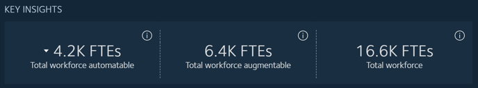
- The total number of FTEs in your workforce that could be automated, at the time horizon selected in the Years filter.
- The total number of FTEs in your workforce that could be augmented, at the time horizon selected in the Years filter.
- The total number of all FTEs in your workforce, at the time horizon selected in the Years filter. This includes FTEs that are impacted by automation and augmentation.
TIP: Use the Scenario filter to compare cost savings and automatable workforce numbers across different time horizons and different automating and augmenting technologies.
What the chart reveals
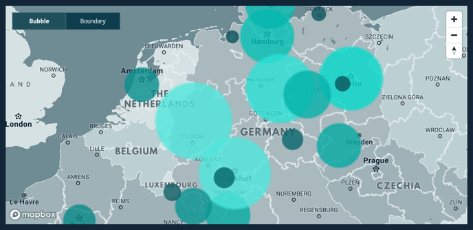
The locations shown will be the locations that have been provided with your workforce dataset, and which are relevant to your organisation. For example, locations could be represented at a country, regional, city or office level.
The size and colour of the bubble indicates the extent of automation or augmentation impact - the larger the bubble and lighter the teal colour, the greater the impact.
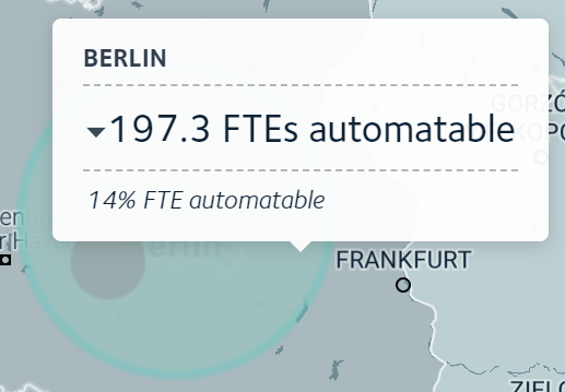 As you mouse over each bubble, a popup will appear with details on the total number and percentage of FTEs that could be automated or augmented.
Different ways to view the insights
Toggle between values displayed as bubbles and boundaries
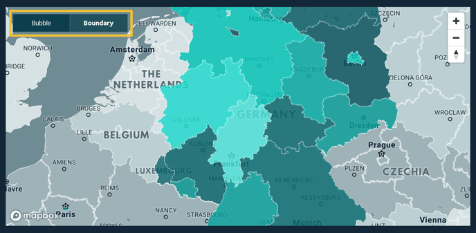
Use the toggle at the top left-hand corner of the map to switch between a view of the map as a bubble chart and a view by location boundary.
Switch between viewing augmentation and automation impacts
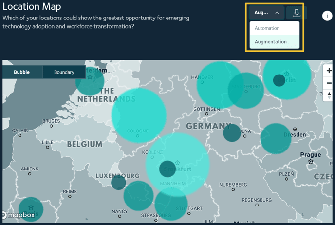
To switch between views of automation and augmentation impacts, use the dropdown menu at the top right-hand corner of the chart.
TIP: To evaluate insights across all locations, use the Download option and download the data in an XLS or CSV file.
View the data in a table
A table below the chart lists each location, along with the numbers and percentages of FTEs that are predicted to be unimpacted, automated and augmented.. This provides a second way, along with the bubble chart, to view the data and compare changes by time horizon and technology type.
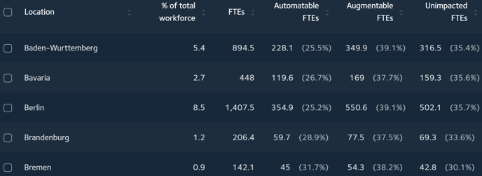
TIP: To reduce the number of locations listed so that it's easier to compare specific locations, use the location checkboxes.
Related articles
Working with the Location Breakdown report
How are the Location Map predictions calculated?