Overview
> What you can use the Location Breakdown report for
> Understand the chart and the insights shown
> Different ways to view the insights
What you can use the Location Breakdown report for
The Location Breakdown can be used to understand where impact is most concentrated in terms of FTEs at risk by workforce location. Depending on an organisation’s structure and how teams are aggregated and dispersed, the charts show where there will be emerging relocation opportunities, potential to merge locations, and the need to minimise overheads and available space to use. It can also help to inform procuring future premises and identifying local education institutions to help bridge workforce skills gaps between current and future jobs.
Understand the chart and the insights shown
Key insights
Below the chart, you'll find three key insights from the workforce data that's represented in the Location Breakdown chart.
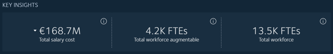
- The total salary costs that could be reduced by automating FTEs, at the time horizon selected in the Years filter.
- The total number of FTEs in your workforce that could be augmented, at the time horizon selected in the Years filter.
- The total number of all FTEs in your workforce, at the time horizon selected in the Years filter. This includes FTEs that are impacted by automation and augmentation.
TIP: Use the Scenario filter to compare cost savings and automatable workforce numbers across different time horizons and different automating and augmenting technologies.
What the chart reveals
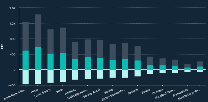
The locations in the chart are those that were provided with your workforce dataset, and which are relevant to your organisation.
The colours represent:
- Light teal - Automation
- Teal - Augmentation
- Grey - No impact
The chart axes represent:
- X axis - locations
- Y axis - number of FTEs
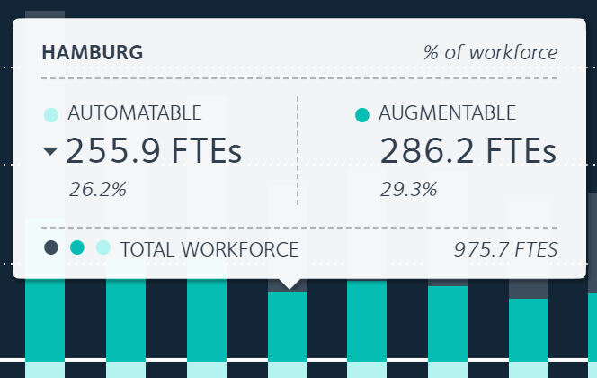 As you mouse over each bubble, a popup will appear with details on the total number and percentage of FTEs that could be automated or augmented, along with total number of FTEs at that location.
Different ways to view the insights
Zoom in
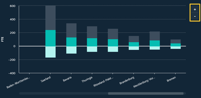
If you have a wide range of locations, and a wide range of FTE numbers at these locations, it may be difficult to clearly view the details at locations where there are small FTE numbers.
Use the +I- buttons to zoom in and out of the bar chart. A scroll bar below the chart will enable you to scroll through all locations.
View the data in a table
A table below the chart lists each location, along with the numbers and percentages of FTEs that are predicted to be unimpacted, automated and augmented. This provides a second way, along with the bar chart, to view the data and compare changes by time horizon and technology type.
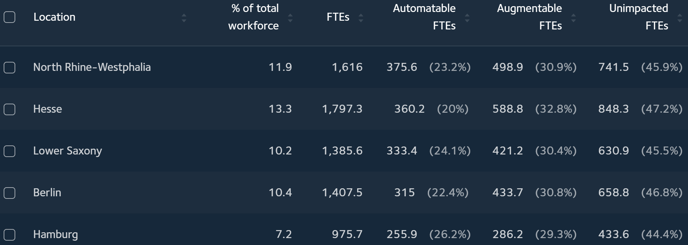
TIP: To reduce the number of locations listed so that it's easier to compare specific locations, use the location checkboxes.
Related articles
Working with the Location Map report
How is the location breakdown calculated?