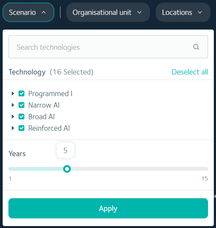
The Technology Timeline forecasts the opportunities and impacts of emerging technologies over a timeframe of one to 15 years into the future.
Overview
> What you can use the Technology Timeline for
> Understand the Technology Timeline insights
> Different ways to view the insights
> Understand the technology adoption curves
What you can use the Technology Timeline for
The Technology Timeline insights can inform your technology adoption strategy by assisting you to identify when, over the next 15 years, to make technology investments, and revealing which technologies are most likely to have a significant impact on your organisation.
Understand the Technology Timeline insights
Key insights
Below the chart, you'll find three key insights from the Technology Timeline workforce data.
.png?width=688&name=Faethm-Platform%20(93).png)
-
- The total salary costs that could be reduced as a result of automation, at the timeframe selected in the Years filter.
- The total number of FTEs that are likely to be automated, at the timeframe selected in the Years filter.
- The percentage of capacity gain that FTEs will experience as their tasks are augmented, at the timeframe selected in the Years filter.
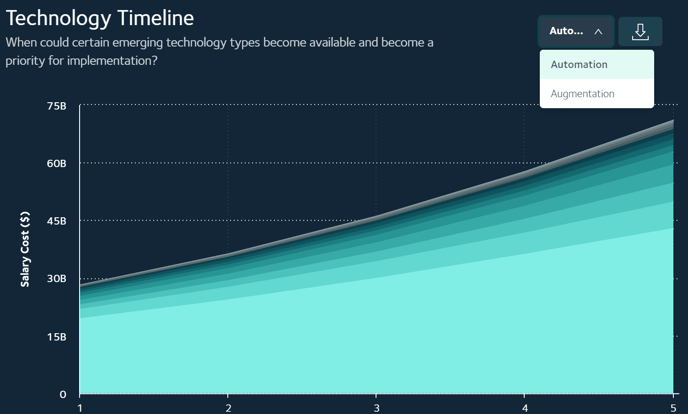
What the chart reveals
Each curve on the chart represents the projected extent to which each technology type will impact FTE tasks (and hence related salary costs and capacity gain) over time. The chart aggregates all predictions across your organisation, displaying total impact proportionally by impacting technology.
When viewing impacts of automating technologies, the volume of each technology curve is represented as budget figure, which is the cumulative salary cost across the workforce.
When viewing impacts of augmenting technologies, the volume of each technology curve is represented by percentage capacity gain. Capacity gain factors in the amount of time that FTE tasks are enhanced by technology, giving them newly available time to perform additional tasks and therefore improving their productivity.
Automating technologies
.png?width=688&name=Faethm-Platform%20(94).png)
-
The chart displays the adoption curves for each technology type over a time horizon of one to 15 years.
- Colour is used to differentiate each curve. The curve with the greatest volume (also the lightest colour) represents the greatest potential cost savings, at that year, from that specific technology type.
- A table below the chart lists the exact currency value of cost savings per year (from one to five years into the future), per technology type.
.png?width=688&name=Faethm-Platform%20(97).png)
Augmenting technologies
.png?width=688&name=Faethm-Platform%20(95).png)
-
The chart displays the adoption curves for each technology type over a time horizon of one to 15 years.
- Colour is used to differentiate each curve. The curve with the greatest volume (also the lightest colour) represents the greatest potential capacity gain, at that year, from that specific technology type.
- A table below the chart and key insights lists the percentage of capacity gain that could be realised per year (from one to five years into the future), per technology type.
.png?width=688&name=Faethm-Platform%20(96).png)
Learn more about the technologies
.png?width=688&name=Faethm-Platform%20(98).png)
As you mouse over the chart, you'll see a tooltip for each technology type, at each year. The tooltip lists the technology type, the year and either the percentage capacity gain or cost savings. To learn more about the technology type, click the name to bring up an overlay with a definition, examples and a use case.
TIP: The smaller the volume of the curves, the more difficult it becomes to accurately roll your mouse over the specific technology type you want to view. For a full view of every technology at each year in your selected timeframe, download the chart in a CSV or XLS file.
Different ways to view the insights
The chart can be filtered to refine future scenarios of automation and augmentation opportunities and impacts.
Use the platform filters
 Using the scenario filters to compare impacts across time horizons and by different technology types is the most common refinement.
For a more granular view of specific segments of your workforce by organisational unit, location, demographics or other filter such as job category, you can continue refining the impact insights using the platform-wide filters.
Switch between viewing augmentation and automation impacts
To switch between views of automation and augmentation impacts, use the dropdown at the top right-hand corner of the chart.
TIP: To evaluate total values across all technologies, use the Download option and download the data in an XLS or CSV file.
Understand the technology adoption curves
Technologies are predicted to impact work based on the human abilities they disrupt or enhance. All 5,000+ jobs in our jobs database are comprised of a set of tasks. Each of those tasks can be either automated or augmented, to some extent or completely, by a technology.
We call this the technology-task (tech-task) combination and have modelled a unique adoption curve for each one. The adoption curve illustrates the likely adoption rate of a technology, given the country and industry ability or propensity to adopt that technology over the next 15 years.
Related articles
Working with the Job Corridor report