Every API Detail page within the API Showcase is designed to give you a consistent, intuitive interface for understanding, testing, and exploring our APIs — whether you're a product strategist, a data analyst, or a developer.
1. Side Panel Overview

Located on the left-hand side of every API Detail page, the side panel provides essential context at a glance:
-
HTTP Method Pill — Indicates the request type (e.g., GET, POST) to help set expectations around how the API is called.
-
API Bundle Tags — Shows which solution group or Bundle the API belongs to (e.g., Job Architecture, Skills Intelligence, etc.).
-
Use-Case Description — A brief explanation of what this API is best used for.
-
API Endpoint URL — A live, copy-ready endpoint path that developers can plug directly into their scripts.
-
Documentation Button — Links directly to the developer docs for detailed implementation info, including authentication, schema, response structure, etc.
The side panel remains consistent across API pages, giving you the key orientation you need to evaluate each API.
2. API Input Section

The input interface lets you test the API directly within the Showcase. While inputs vary based on the API’s design, the section generally includes:
-
Primary Input Field — Type or search for terms from our ontology (e.g., occupations, skills) with a Name-to-Code toggle. This toggle allows you to switch between readable input and ontology ID.
-
Optional Parameters — Inputs like country code, filters, or time ranges, based on what the API supports. These mirror the optional query params in the documentation.
-
Apply Button — Once your inputs are selected, click Apply to generate the response output.
This section is designed to reduce friction, especially for non-developers, while staying faithful to the underlying API design.
3. Output Area

The results section updates based on the input and returns real data fetched from the live API. Output varies per endpoint but follows several consistent UI conventions:
-
Card-Based Results — Each insight appears in a self-contained card, styled for readability.
-
Interactive Charts/Tables — Some APIs show results visually (e.g., trend lines, skill bars) to enable pattern recognition.
-
Ellipses Button ( … ) — A cross-API shortcut button that allows you to take an entity (e.g., a skill or occupation) and pass it into another compatible API for further exploration. This helps reduce dead-ends and encourages deeper discovery.
⚠️ Note: For skills or occupations passed through the ellipses button, switching the input toggle back to "Name" reveals the resolved ontology term.
4. Explore Further Section

Positioned at the bottom of the page, this section ensures that users are never left without direction. It includes:
-
Explore Further with Existing Input — Surfaces APIs that accept the same input type, enabling immediate cross-navigation.
-
Recommended Next Steps — Curated links to other APIs that relate to this endpoint’s purpose, sometimes showcasing a broader journey or upsell path.
This section is helpful for both evaluators and strategists to understand how a single API fits into a larger data story.
5. Individual API Page vs Group API Page
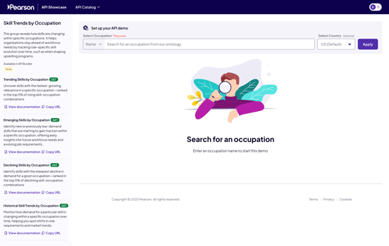
On a Group API page, you'll notice a few key differences:
-
The side panel lists multiple API endpoints rather than a single use-case description.
-
Each listed API includes a direct link to its documentation.
-
The insights are designed to work together — for instance, in "Skill Trends by Occupation":
-
The Trending Skills API populates a list of relevant skills.
-
Selecting a skill dynamically triggers the Skill Trend by Occupation API, which renders a chart comparing how that skill appears across occupations.
-
This grouped view creates a smoother exploratory experience when APIs are conceptually or functionally linked.
Summary
-
Explain its purpose clearly (side panel)
-
Let you test inputs quickly (input section)
-
Show real data responsively (output section)
-
Guide you to what’s next (Explore Further)
And in some cases, group multiple APIs when they work better in tandem.
These consistent patterns help make evaluating and comparing APIs easier — especially for cross-functional teams.