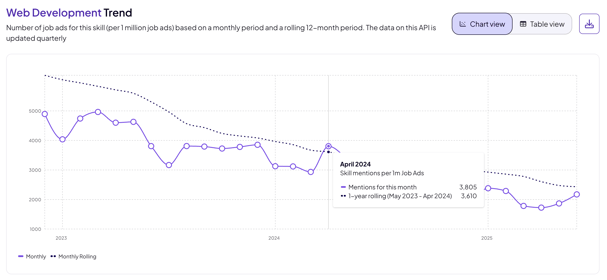
This view is powered by the Historical Skill Trends API, and gives you a longitudinal view of workforce demand by showing how frequently a skill is mentioned in job advertisements each month.
What this chart shows
Each line on the chart represents one skill and shows how often it was mentioned in job market in general across a rolling 12-month window.
The y-axis reflects the number of mentions across one million job postings, giving you a normalized view for easier comparison across roles and markets.
The x-axis shows the timeline — usually 12 months — so you can see trends and inflection points.
🔎 Example: If "Data Visualization" is a trending skill for Data Analysts, the chart may show a steady upward line, indicating growing demand over the past year.
Why it matters
Understanding historical skill patterns helps you:
-
Validate whether a skill trend is real
See if a spike is part of a sustained rise or just noise. -
Spot early signals
Identify rising skills that might not yet appear in official frameworks or training plans. -
Time your response
Align learning investments, hiring campaigns, or curriculum adjustments with actual market shifts. -
See industry-specific demand
Filter by industry or region to contextualize a trend.
How to read the values
When you explore this chart in the API Showcase, you’ll see two types of values depending on where you’re looking:
| Location | Metric Type | Description |
|---|---|---|
| Tooltip (on hover) | 1-year rolling average | Smooths short-term volatility. Useful for understanding the sustained interest in a skill over time. |
| Chart legend | Monthly value | More sensitive to recent shifts or dips. Indicates what’s happening now. |
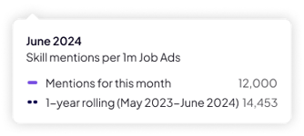
📌 Example:
In June 2024, the tooltip shows:
-
Monthly mentions: 12,000
-
1-year rolling avg: 14,453
This means mentions were slightly down compared to the long-term trend
What does “rolling” mean?
A rolling value calculates the metric (e.g., mentions) across a moving time window:
-
1-year rolling average: shows the average number of mentions over the past 12 months (updated monthly).
-
Monthly value: shows the mentions for just that month, potentially more volatile.
Using both helps balance short-term changes against long-term consistency.
Why both are useful
| Metric | Best for | Interpretation |
|---|---|---|
| 1-year rolling avg (tooltip) | Spotting sustained demand | Helps you understand whether a skill is steadily growing or declining |
| Monthly value (legend) | Capturing short-term shifts | Useful for spotting recent surges or dips in attention |
By comparing both, you can distinguish between:
-
A temporary spike (e.g., sudden news cycle or hiring burst)
-
A true trend (ongoing increase across multiple months)
What to do with this data
Use Historical Skill Trends to:
✅ Prioritize skills that are clearly gaining traction
✅ Investigate declines and whether they signal market shifts
✅ Align internal frameworks to reflect external demand
✅ Cross-check emerging trends with job descriptions and curriculum
This insight is especially valuable when combined with Trending, Emerging, and Declining Skills by Occupation APIs — available as related views in the API Showcase.